Revivals of revivals
by David Shields. Average Reading Time: about 7 minutes.
In the early 15th century in Florence, Italy an inscriptional letterform was developed in contrast to the existing Gothic and Romanesque forms that would lead to a revival of the classical Roman by the end of the century. By the end of the 14th century the early Renaissance scholars—Petrach and Niccoli—began looking back to Carolingian manuscript forms for inspiration as they transcribed classical texts. This work strongly influenced architects and sculptors of their time—namely Brunelleschi, Ghiberti, Alberti, and della Robbia—who were themselves looking at ways to better aline with what they perceived as a humanistic antiquity.
Nicolette Gray wrote the essential text on the development of these letterforms she referred to as the ‘Florentine Sans Serif’ in her 1960 essay “Sans serifs and other experimental inscribed lettering of the early Renaissance” first published in Motif 5 (London, 1960) and fetchingly reproduced in 1997 by LetterPerfect (Paul Shaw & Garrett Boge) to promote The Florentine Set, their digital typographic revival of these letterforms.
The inscriptional letterforms developed in Florence in the 15th century were strong influences on several typographic revivals of the late 19th and very early 20th centuries. Two faces, in particular, Florentine Old Style and Della Robbia, were strongly influenced by letterforms from this period. They were first produced by the American Type Founders Co as metal type and were cut, through a licensing agreement with The Hamilton Mfg Co as wood type in the 20th century. 1
The Florentine series
While not a revival of the highest fidelity, this design was based closely on what Nicolette Gray described as the Renaissance or Florentine San Serif 2 Seen most clearly as an inscriptional letter found on the ledger tombs in the floor of Basilica of Santa Croce in Florence “they are not like Carolingian capitals, nor are they related to carved Roman letters” 3 but served as a transition away from the earlier Romanesque and provided movement towards the later classical Roman revival.
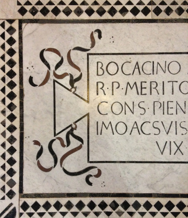
Floor tomb with marble inlay, Basilica of Santa Croce, Florence.
The American Type Founders Co (ATF) specimen catalog of 1896 first showed Florentine Old Style and stated that “many of the characters are transcripts of the lettering of a famous Italian monument of the sixth [sic] century.”
Mac McGrew 4 credits Ludvig Sandöe Ipsen (1840–1920), a Danish architect and illustrator living in Massachusetts, as the designer. Ipsen did file patent applications for two style variations of the series including Florentine Bold Condensed (US Design patent No. 36,366) and Florentine Bold Extra Condensed (US Design patent No. 36,367) in April of 1903. Both applications were approved on June 16, 1903. There is no clear evidence that Ispen designed Florentine Old Style released by ATF in 1896 or the Florentine Heavyface, later rename Florentine Bold, from 1898.
William Loy 5 credits John Franklin Cumming (1852–1940) as the influential engraver of the Florentine series for ATF. While Loy intimates that Cumming had an extremely strong influence on the final design of the letterforms, he only credits him as the engraver, not the designer of the Florentine series.
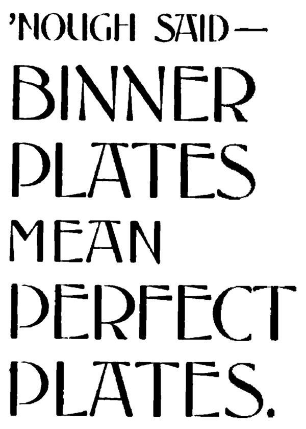
Binner Engraving Company hand-lettered capitals.
The Type Heritage Project indicates that the Binner Engraving Company based in Milwaukee and Chicago, developed a hand-rendered all-caps face they used for their marketing material sometime around 1894, but not used after 1897. It is unclear if Ipsen had any involvement in developing this version of the face, but at the very least, it seems highly plausible, and rather likely, that ATF based their own cut of Florentine off of Binner Engraving’s lettering.
At the time the face was first released, R Coupland Harding writing in his regular column for The Inland Printer 6 put forward his own ideas on where the face originated: “(s)ince the formation of the company [ATF] the names of the originating houses have been kept somewhat in the background. I suspect that this new face which is sure to be popular is one of the Dickinson Foundry’s revivals.”
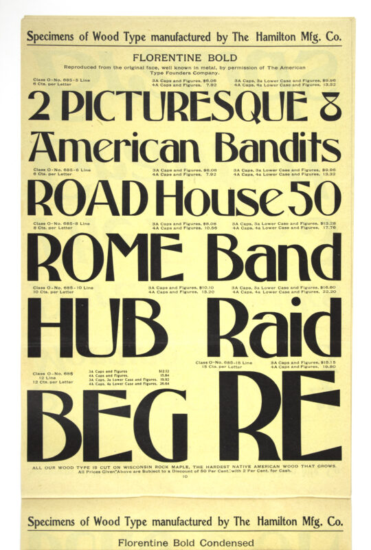
Florentine Bold in The Hamilton Mfg Co’s 1905 specimen circular.
The Florentine series was first shown as wood type in The Hamilton Mfg Co’s 1905 8-page circular which showed three styles Florentine Bold (named No 685 by Hamilton), Florentine Condensed (No 686), and Florentine X Condensed (No 687). Each style was shown in 5-, 6-, 8-, 10-, 12-, & 16-line sizes. Hamilton made clear the licensing arrangement with ATF by stating that the series was “reproduced from the original face, well known in metal, by permission of the American Type Founders Company.” The Florentine series’ success as wood type seemed to have been short-lived as it was not shown in any known Hamilton specimen catalogs after it appeared in Catalog No 17, of 1908.
Though having very little resemblance to the turn of the century revivals of the Florentine San Serif, fifty years later Hermann Zapf would use the original floor tomb inscriptions to great success as the basis for his Optima series in the 1950s.
Della Robbia
Luca della Robbia was a Florentine sculptor apprenticed to Lorenzo Ghiberti early in his life. Originally worked in stone before moving to terra cotta and developing a closely guarded glazing process that his workshop would continue using well after his death in 1482. His work can be seen primarily in Florence and Rome though there are strong examples throughout the Tuscan region. Della Robbia, possibly influenced by Ghiberti, developed an inscriptional and painted letterform that showed the addition of serifs and terminal flairs that moved the Florentine sans more toward the Roman revival that would develop at the end of the 15th century.
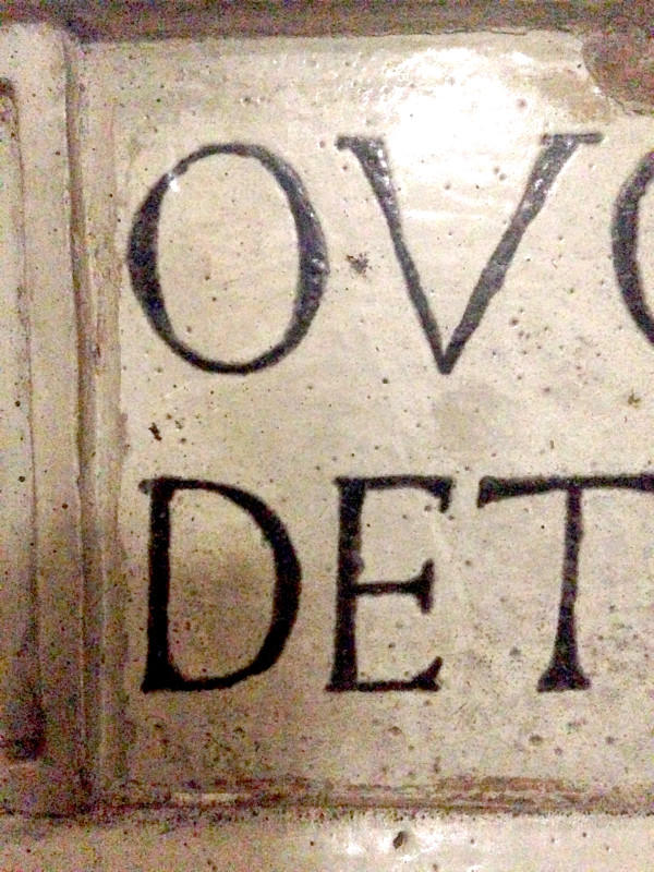
Detail of Crucifixion by Della Robbia workshop, Santa Maria Primerana, Fiesole.
Mac McGrew credits Thomas Maitland Cleland (1880–1964) with the design of the typographic Della Robbia released by ATF in 1902. David Consuegra 7 credits David Bruce’s New York Type Foundry for commissioning the design of Della Robbia in early 1902. The New York Type Foundry had been absorbed by ATF in 1901 and would continue to operate under its own name until 1906. On a trip to Italy, Cleland had made rubbings of the Florentine sculptor’s 15th-century inscriptional letters found in Rome that influenced his design for the face. A second weight, Della Robbia Light, was subsequently designed by Morris Fuller Benton in 1913 for ATF. Both Monotype, Damon & Peat, and Stephenson Blake of England each developed subtle copies of this face in their own competing catalogs. Damon & Peat referred to their version as Armstrong, while Stephenson Blake offered their design as Westminster Old Style.
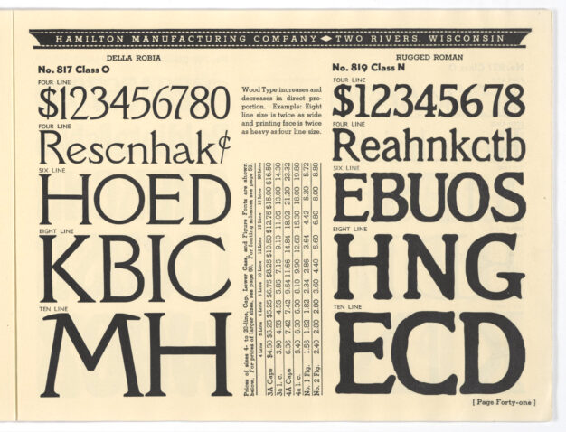
Della Robbia in The Hamilton Mfg Co’s 1938 specimen catalog.
Della Robbia was first shown as wood type in Hamilton Mfg Co’s 1938 72-page, soft cover Catalog No 38. It showed a single weight of Della Robbia (named No 817 by Hamilton) in four sizes: 4-line, 6-line, 8-line, and 10-line. Curiously there is no licensing indication that this is an ATF face. It is also curious that there was a 36-year lag between the face first being shown by ATF and is being offered as a wood type by Hamilton. Hamilton (then Hamilton Industries, a Division of American Hospital Supply Corporation) showed this face as late as 1973. The 1973 Hamilton Woodtype catalog is their last know published catalog before they sold the wood type manufacturing portion of the business in 1984.
- In October 1891 after the purchase of Page & Co by The Hamilton Mfg Co in January of that year, a New York Office was established at 16, 18, 20 Chambers Street. Henry L Bullen was hired and placed in charge of Hamilton’s New York Office, handling all orders east of Pittsburg. The New York Office remained active until stock in the Eastern Branch of The Hamilton Mfg Co was sold to American Type Founders Co in 1893. Through this sale, Hamilton entered into a licensing agreement with ATF that would last until Hamilton stopped making wood type in the 1980s. Bullen would become advertising manager of ATF and in 1908 librarian of the ATF Typographic Library and Museum (now in the care of The Butler Library at Columbia University since its acquisition in 1936.) [⇑]
- Gray, Nicolette. “The fifteenth century and the Italian revolution,” A History of Lettering: Creative Experiment and Letter Identity. 1st ed. Oxford: Phaidon Press, 1986.[⇑]
- Gray, 122[⇑]
- McGrew, Mac. American Metal Typefaces of the Twentieth Century. 2nd ed. New Castle: Oak Knoll Press, 1993.[⇑]
- Loy, William E. Nineteenth-Century American Designers and Engravers of Type. Ed. Alastair M. Johnston and Stephen O. Saxe. New Castle: Oak Knoll Press, 2009.[⇑]
- Harding, R Coupland. ‘Review Of Type Designs.’ The Inland Printer, 17 (June 1896): 316–317.[⇑]
- Consuegra, David. American Type Design and Designers. New York: Allworth Press, 2004.[⇑]